Recently, Jaclyn and I took a lunch date to tour the Saint Paul City Hall and Ramsey County Courthouse. Tours of the building are held on various Mondays. They begin at the bottom of the Vision Of Peace, a massive statue in the towering bemarbled lobby.
I recommend taking the tour. I also recommend calling ahead to ensure the tour hasn’t been canceled or postponed. Our tour was delayed by an hour and a half. So we rode to a place for an overpriced and mediocre sandwich.
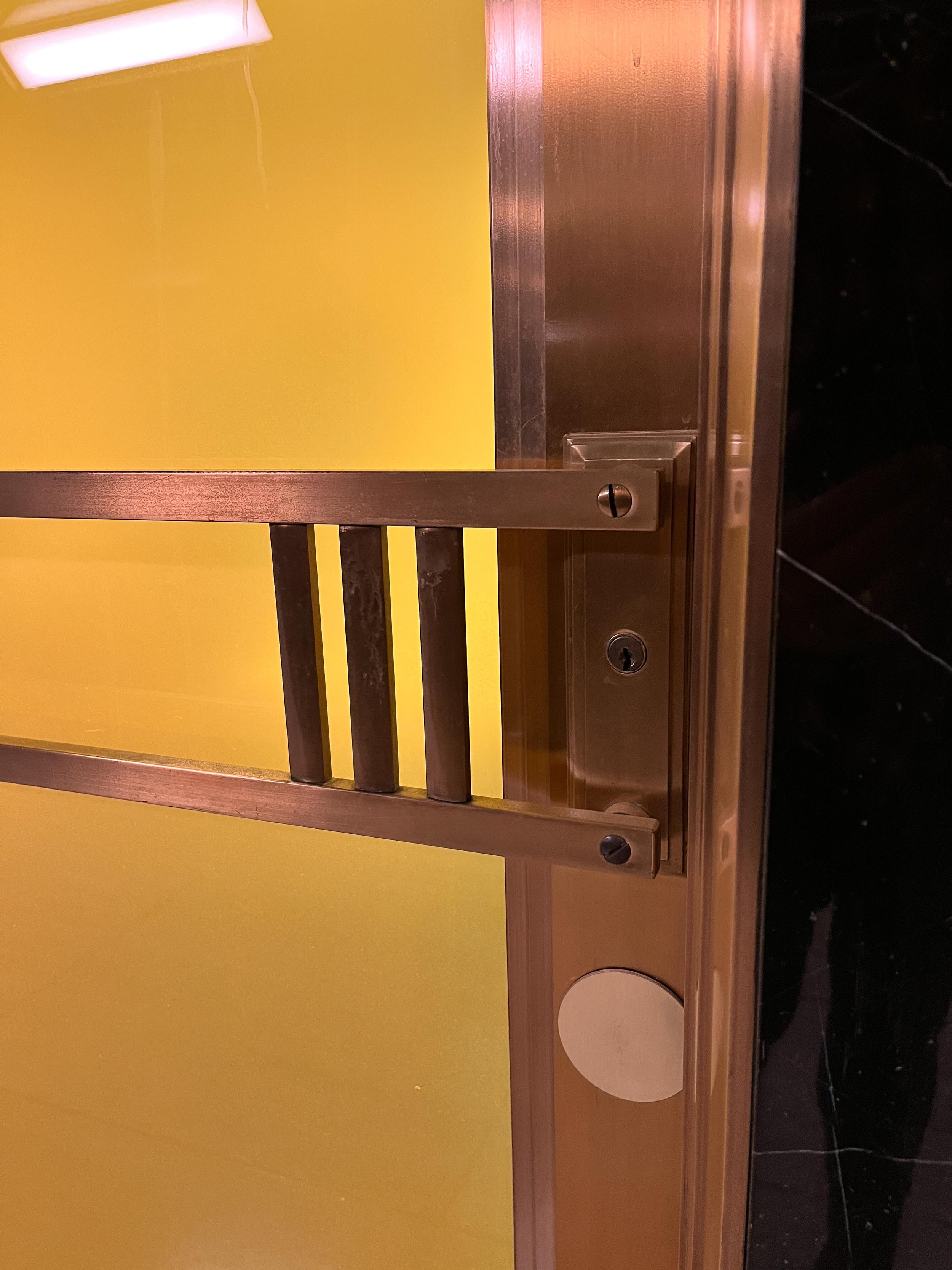
At the start of our tour, the guide encouraged us to keep an eye out for elements and features of the building that come in sets of three. These items signify the “rule of three” in architecture. Art Deco, it turns out, is lousy with the rule of three.
I was peripherally familiar with a similar concept in photography, “the rule of thirds.” In Art Deco architecture, the rule of three is used to for similar effect, to create vistas that are more visually compelling and memorable with a use of:
Repetition of patterns such as repetitive geometric structural details and motifs which are frequently organized in groups of three to create a sense of balance and harmony in the design.
Triple division in which a facade might be divided into three vertical sections or a window may be comprised of three distinct parts. This division helps to break down the overall design into visually pleasing and balanced components.
Decorative details such as intricate and stylized decorative details, ornamental reliefs, decorative panels, three stylized figures, or three repeated design elements.
Three-dimensional form in a spatial arrangement to create a sense of depth and dimension. This could be the layering of architectural features like setbacks in a building's facade or tiered structures.
Symmetry and asymmetry. Ahhh, symmetry. Where elements are mirrored on either side of a central axis, often involving groupings of three balanced in a visually pleasing way.
It seems the common thread between these design principles is that they build a sense of rhythm, balance, and proportion, creating visually appealing and harmonious designs.
This has to be what draws me to Art Deco architecture. For someone who has particular difficulty with asymmetry, Art Deco provides refuge and a sense of order and—even though the term is possibly overused here—balance.
That is not to say I discount asymmetry wholesale. I’m sure it has its place. But the instances I’ve encountered imbalance have been frustratingly random and nonsensical. The famously asymmetrical design of the Pittsburg Steelers is a prime example.
The Pittsburg Steelers have the only helmet in the NFL, or any helmet in sports that I know of, with the logo on only one side. It is a baffling decision, one that provokes such a gut response in me I previously believed the decision must have been made for a very good reason. It must mean something, right? Wrong.
It turns out the decision was an arbitrary choice made by an equipment manager for the Steelers named Jack Hart. As the story goes, Mr. Hart had been instructed to affix the team decal on a helmet. However, nobody specified whether the decal should be on both sides or just one. So Mr. Hart placed the decal exclusively on the right side of the helmets.
It appears there was no effort to correct the error. The most I could find was that once done there was no further modification to the helmets.
I’ll concede, this story is charming. But there’s something about the design of this helmet, and the story of its origin I can’t get out of my head.
At best, it seems like a goofball tale of ineptitude with a folksy, aw-shucksian moral. At worst, the helmet feels like the childish work of an antagonist that, once discovered, escalated to stubborn contraryism. Probably I am so bothered by the Steeler’s helmet because it feels like a deep impasse. An inflexibility or inability to accept our mistakes or work to undo them. The precedent suggest the best course of action is to, rather than fix the error, double down and dig-in to what we know in our heart-of-hearts is the wrong way to be.
We very much enjoyed our tour of the Saint Paul City Hall and County Courthouse. If you are interested in the building, check out my other photo galleries here and here. If you’re like me, once anyone points out the rule of three and its role in Art Deco designs, you’ll begin noticing features that might’ve otherwise gone unnoticed. It’s an easter-egg hunt through the City Hall and County Courthouse looking for and finding series and patterns of three.
Maybe just don’t be like me and point these out to perfect strangers without any context.
Update:
Jaclyn has reminded me that asymmetry is not an inherent product of ineptitude. She also noted that asymmetry does not necessarily indicate poor design. Asymmetry, she said, can be intentional and well-planned and it shouldn't automatically be associated with a lack of quality or effectiveness.
That is a fair point.
It is a good reminder that I need to challenge myself to aspire to a more nuanced perspective on design, one that accepts how asymmetry can be a deliberate and valid choice in the creative process.


